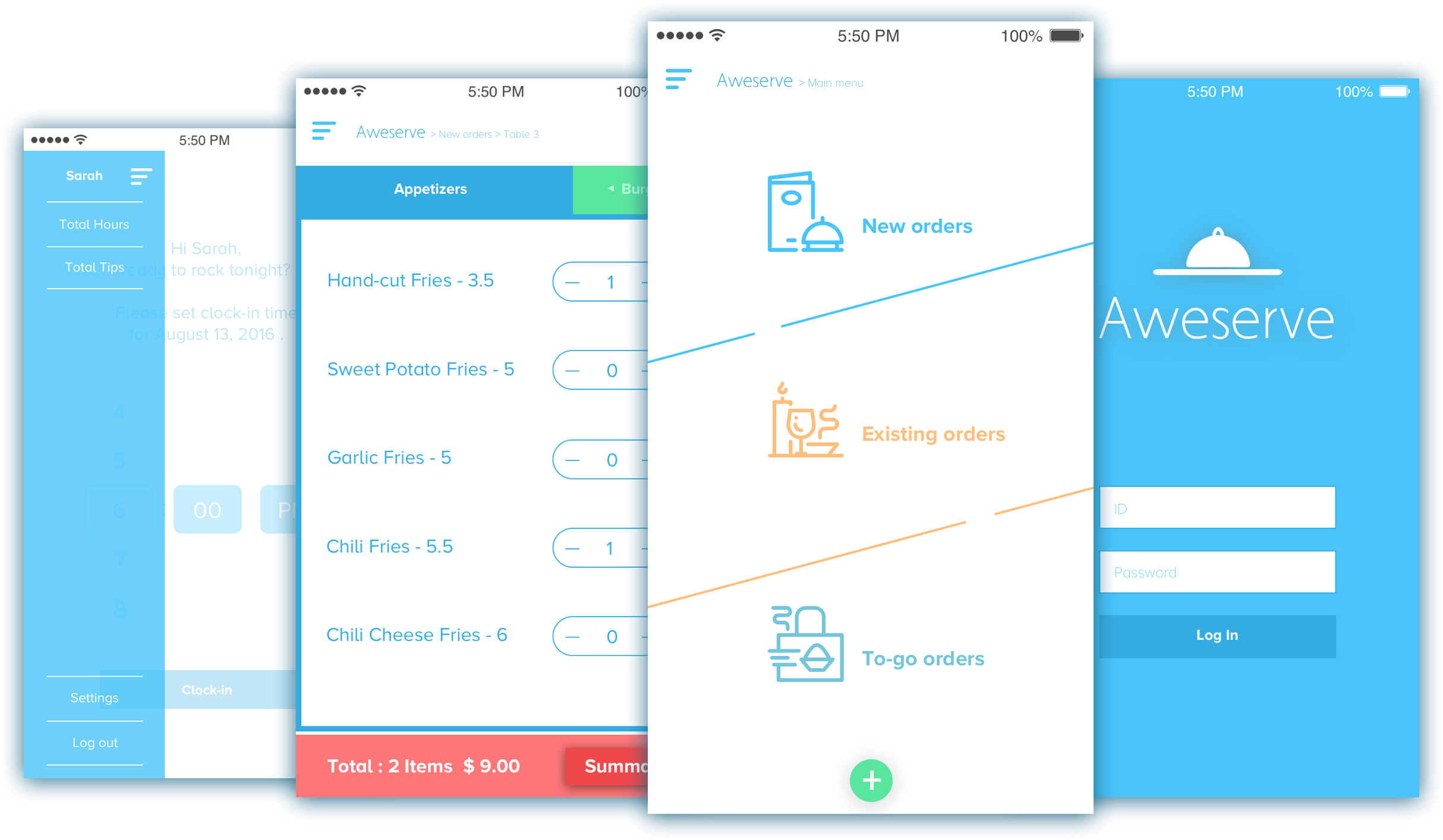
AWESERVE | MOBILE
– – –
CONCEPT APP DESIGN | POINT OF SALE
Can you believe there are still businesses running without computer systems?
I know it’s hard to believe, but they exist.
One of my favorite restaurants is one of them. They still use paper order sheets and tear them apart to pass the order to the kitchen staff. And they use analog calculators to calculate order totals.
Through that context, I prototyped how a mobile Point Of Sale (POS) app could solve some of these problems and make it easy for servers to take orders.
ROLES
IDEATION | VISUAL DESIGN |UI DESIGN |UX DESIGN
INTERACTIVE PROTOTYPE
UX PROGRESS
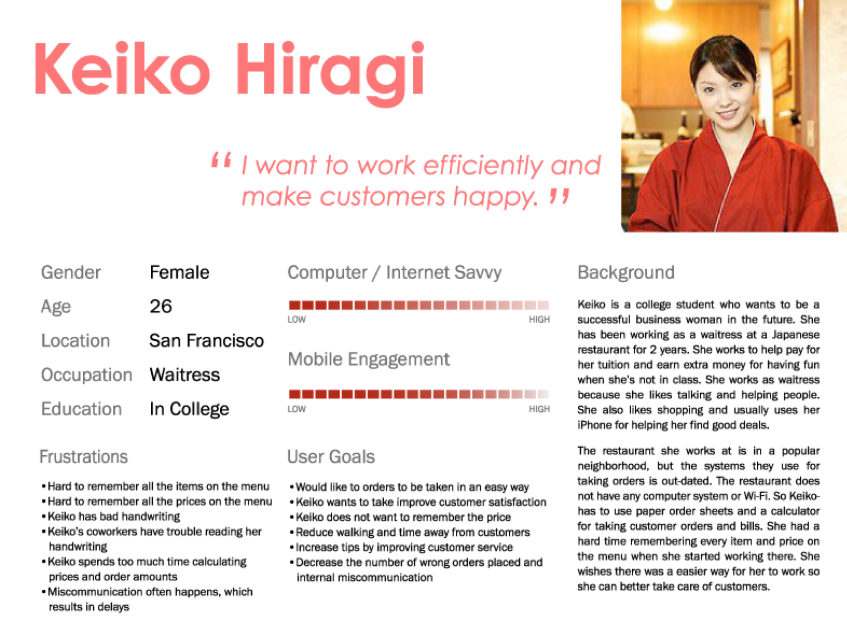
Persona
To understand better my target users, servers, I created a persona : Keiko, a waitress.
Keiko goes to college and works part time as a waitress and is fairly computer savvy. She doesn’t have a lot of time, so making the app as simple to use as possible is key.
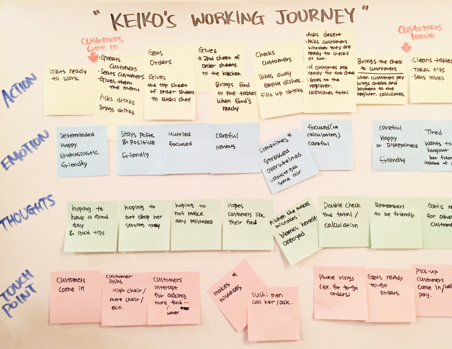
User Flow
This user flow shows what Keiko’s typical work flow is like.
Keiko’s work starts when customers step into the restaurant and ends when they leave.
By categorizing 4 different states: Action, Emotion, Thoughts, and Touch points, she experience’s, we can see what’s happening during the course of a shift at work.
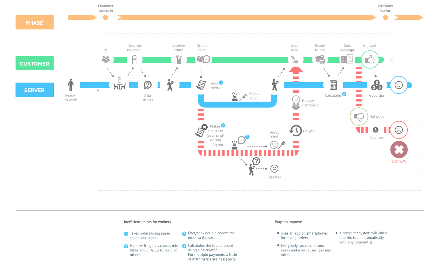
Journey Map
This journey map is based on the flow of a typical customer visiting the restaurant. The blue line shows when everything goes well, which the goal for Keiko is getting good tips. The dotted red line shows when something goes bad, and the consequence is bad tips for Keiko.
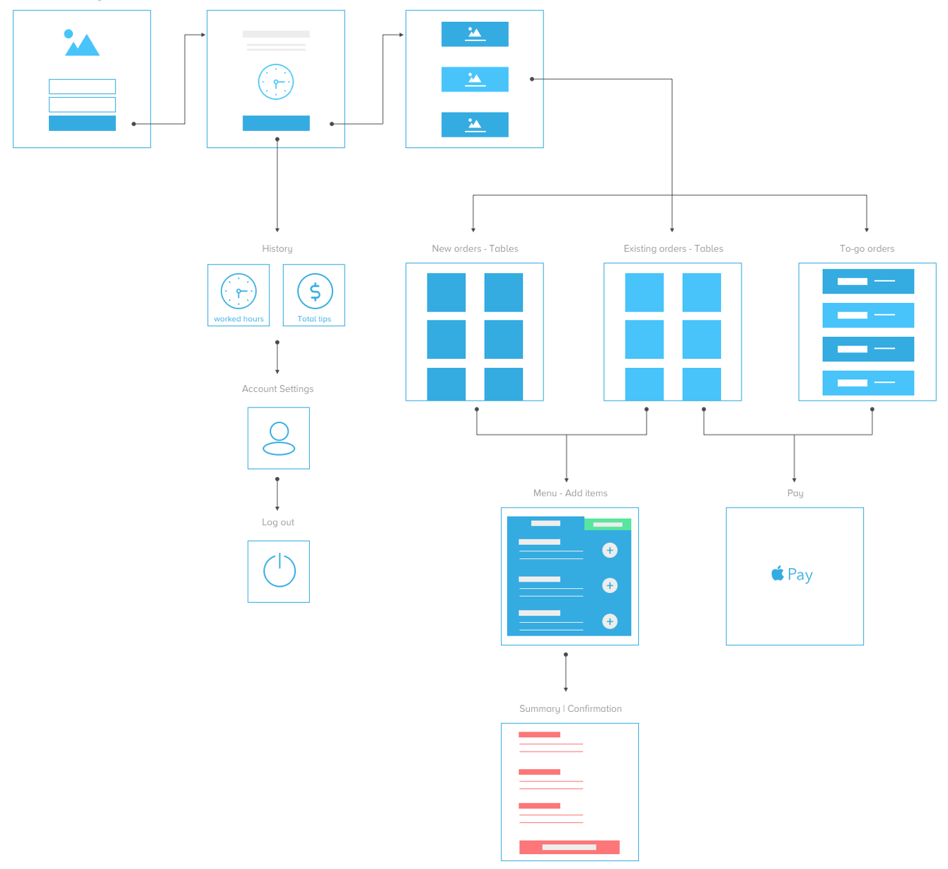
App Flow
This diagram shows the app flow and simple high-level wireframes.
© JI CHOI 2021
